Saturday, 21 April 2012
Wednesday, 4 April 2012
How effective is the combination of your main product and ancillary texts?
Trailer
Although we went through quite a few changes when developing our trailer, I feel that we have successful produced a good final product for our advanced production. The transitions between the shots such as the fade in and fade out effect allows the trailer to run more smoothly, to avoid quick cuts and preventing the audience from being confused and unable to follow the narrative of the soap. The use of the credits separating the scenes with subtitles is presented with a black background and white font. This is effectively in proposing the seriousness of the context of the soap to the audience which is the intended effect we plan on displaying. The technique of using these credits also builds up tension as it is foreshadowing in terms of presenting the audience with enigmas, where at the end of the trailer, after the build-up of tension, and after the title of the soap appears, we can see someone has hung themselves. This scene appears unexpectedly, which is effective in grabbing the audiences’ attention and attracting our intended audience. The music used has an upbeat sound with constant changing in tempo to match the mise-en-scene of the scenes shown. As the music is used throughout the trailer, it allows the audience to identify with the trailer and sets the pace and feel of the soap.
Overall, I feel our soap trailer is very effective as it gives the audience an understanding of what the soap is about and what to expect, without giving away the full storyline of the soap. I find this is essential in presenting an effective soap, as it attracts the intended audience rather than misleading an opposed audience.
TV Listings Magazine
In order to produce my TV listings magazine, I used Microsoft Word to produce the cover as well as a software called Adobe Photoshop to cut out a picture of the main characters, which I then added to my magazine cover on Microsoft Word. I began by researching other TV listings magazine covers to gain an insight as to what is expected to be displayed. As our target audience is teenagers, I decided to have the price of my magazine reasonably low as it would be harder for my intended audience to purchase the magazine if its cost is high. I feel that a teenager would commonly buy these types of magazines.
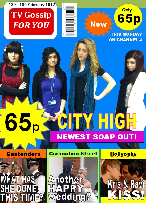
A good strength of my magazine is the use of large text for the title of our soap. The colours used works well with the title as the title doesn’t seem to reveal much about the context of the soap, only that it is based in a school, whereas the colours used are common, casual colours used in TV listing magazines. I decided to use the colours pink and yellow for the title as together they look very feminine, clearly showing the audience that the soap is based on four teenaged female characters, also with the focus of the magazine being on the four characters displayed in the centre of the magazine cover. This is effective in attracting our target audience as we intend to focus primarily on the female market, particularly teenagers and those who will relate well to the storylines of our soap. I feel that the large logo of the magazine also help in making the magazine name clear with the use of the colours red and white, which contrast well with the background, making it stand out more and look more vibrant.
I feel that one aspect of the TV listings magazine which could be improved was the lack of information about the soap we are promoting. The image of the four girls in the centre show different personalities, and having one character looking down and stand away from the other three characters, allows the audience to get ideas on the storylines of the soap; however, not all purchasers will understand the storyline based of the image and title. More information may need to be displayed on the magazine cover in order to make the viewers feel that they are getting value for money when purchasing our magazine.
Website
Looking at our website, I can see the strengths in our websites. For example, the use of feminine colours is effective in attracting our intended audience; which are young females. The pastel colours used worked well in terms of allowing smooth transitions between the different webpages. The menu at the top of the site allows clear navigation around the whole site for viewers. We also added doodles to design our webpage, creating a younger feel to it, promoting our soap to a younger audience. Images and information of the characters are also shown on the webpage, to provide the viewers with details on what to possibly expect in the soap, where some of the things about the characters may relate to the audience. For example, Amber’s character has a drinking problem, which may be something the audience can relate to; further promoting the soap and attracting the target audience.
However, there are also things which could be improved in our website. One thing which could be improved is adding more pages to allow the audience to be more involved in the soap and also so that they have a better understanding of the storylines of the soap. Also, another thing which could be improved is making the website more interactive in order to keep the audience involved and on track of what is going on in the soap.
Evaluation Task - Plan
The evaluation task consists of four questions:
1. In what ways does your media product use, develop or challenge forms and conventions of real media products?
2. How effective is the combination of your main product and ancillary texts?
3. What have you learned from your audience feedback?
4. How did you use media technologies in the construction and research, planning and evaluation stages?
As we have four group members, we decided to split the four questions among ourselves. The evaluation question I will be answering is the second one. I will be splitting the question into three parts with separate headings: Trailer, TV Listings Magazine and Website.
Wednesday, 14 March 2012
TV Listings Magazing Cover - Changes
As the title of our soap was 'The Secrets Within', we had to change it to 'City High' due to the feedback we got when showing our soap trailer to our focus group. The title, 'The Secrets Within', seemed to be more of a film title rather than a soap title; therefore we changed it to 'City High' as this resembles more of the teenaged life the audience will be shown in the soap.
Below is the final version of our TV listings magazine cover:
Below is the final version of our TV listings magazine cover:
Thursday, 8 March 2012
TV Listing Magazine Cover
Firstly, before I began to create my TV listings magazine, my group and I took a few shots of ourselves as we are the four main characters in our soap. At first, we decided to all stand together, looking into the camera smiling. After taking a few pictures in this way, we noticed that in the shots, our characters were not being portrayed effectively. We then took more time to think of what needed changing and subsequently decided to present:
- Tanny with a funky hairstyle and fashion sense to display a crazy character.
- Amber with glasses and the only character wearing her ID badge, showing that she is the brainy one out of the four girls presented. Also, this presents to the audience that these four girls are students; showing that the soap is based on teenagers.
- Louise with the hand-on-hip pose to display her character as a confident, popular teenager.
- Diane, the most important character in the trailer, looking down rather than into the camera, and also standing away from Tanny, Amber and Louise.
The purpose of this was to leave the audience questioning the storylines behind our soap as the mysteriousness of Diane’s character shows that there is some sort of secret and leads back to the name of the soap “The Secrets Within”.
For the title, I decided to have the font enlarging for each of the three words to show the build up of tension in the soap; however, the colours used are almost playful with the title as the title seems sinister whereas the colours used are common casual colours used in TV listing magazines. I decided to use the colours pink and yellow for the title as together they look very feminine, clearly showing the audience that the soap is based on four teenaged female characters. This is effective in attracting our target audience as we intend to focus primarily on the female market, particularly teenagers and those who will relate well to the storylines of our soap.
For the background, I decided to use the colour bright blue as this allowed pictured to stand out more effectively and be attractive to the eyes of the audience. I then added the logo of the magazine using the colours red and white as these colours contrast well with the background, making it stand out more and look more vibrant.
I added the common things found in a TV listings magazine; such as the cost of the magazine, the bar code and the issue date. To reinforce the low price of the magazine to the reader, I decided to show the cost twice, with the use of a yellow star on the left of the magazine, and a yellow circle on the top right corner of the magazine. The colour yellow works well as it stands out in the magazine, contrasting well with the blue background and drawing the reader’s attention to the relatively low price of 65p. This is a decent price as our target audience are teenagers (some being students) who may not be able to afford high priced magazines.
I used the bottom quarter of the magazine cover to display the storylines of other soaps; such as Eastenders, Coronation Street and Hollyoaks, using different coloured boxes to present each one in, making a differentiation between the soaps. I advertised these three soaps on the cover of my magazine as they are well-viewed and successful. Therefore I promoted them on my magazine cover to encourage readers to purchase the magazine.

Friday, 2 March 2012
TV Listing Magazine Cover - Research

Wednesday, 15 February 2012
Shots of our location

We decided to use this toilet to shoot the scene in which Diane hangs herself as this is one of the few places in school where students can depart themselves from everything else by locking themselves in. It is therefore seen as typically the most likely place for someone to commit suicide in a school environment. As we planned to leave her identity as a mystery, we decided to only show her feet dangling at the end of the trailer. We took into consideration that this scene has hazards, which need to be dealt with, therefore we had Diane holding herself up with the bar as shown in the picture above. The mise-en-scene of this scene is effective in terms of being an obscure shot, which will be shown unexpectedly, capturing the audience’s attention and making them more drawn into the storyline behind the suicide.

We originally planned to use this toilet to film the shot in which Louise walks in to find the dead body, however whilst filming, we found that the toilet was not long enough to create an effective shot as it was too small.

After realising the problem with the other toilet, we deciding to film in this toilet as its longer, and therefore it is easier to get more mise-en-scene into the shot. We decided to use a high-shot whilst filming this scene to almost act like a CCTV camera. This may work well in terms of making the audience feel as though they know more than the characters in the sequence know.

We used the Sixth Form common room to create a sense of social realism, to show the audience the everyday social hangout which is shown in two clips in the trailer. Here, we plan to introduce the four girls in soap by panning the camera to follow the girls into the room, and merge shots together to show them as close friends. This will help the audience identify with this environment as the centre point in the soap.

This location is where we planned to film an over-the-shoulder shot in which Diane is looking out of the window, and over-looking her is a hooded character whose identity is unknown. This creates a sense of uneasiness for the audience as they begin to see Diane as the vulnerable character, and potentially a victim.

We used this location as the mise-en-scene of the walls and staircase create an edgy feel, communicating that there is more to the scene. Moreover, we plan on panning the camera whilst Amber and Tanny walk across this corridor. This is effective in proposing to the audience the environment of a school due to the notices put up as well as the photos of art work by students, allowing them to relate to the surroundings.

During the scene of this shot, the camera pans to follow Amber and Tanny, who are having a conversation about Diane. This seems to leave the audience questioning the story behind Diane and why she is such a vulnerable character. We decided to use this corridor as the way in which the mise-en-scene allows the corridor to look narrower as it goes further down, it can be used to imply Amber and Tanny making their way to the answers of the audience and their own questions.
Thursday, 2 February 2012
Plan for filming
Location - School building.
Below is the narrative of what is going to occur when we film and what we are going to film throughout the trailer:
Monday:
· Amber, Louise, Diane and Tanny are seen walking together down a corridor.
· They enter the common room and sit together closely.
· The purpose of this scene is to show a strong sense of friendship between the four girls. The common room is also shown in this first scene to present a community.
Tuesday:
· Diane is shown sitting alone in the common room.
· She looks around, almost in search of someone and then receives a text.
· The camera pans around into a point-of-view shot to show the text which reads “I know you did it.”
· The intention of this scene is to show that there is some mystery behind Diane’s character.
Wednesday:
· Amber and Tansu are shown walking together in the school corridors, talking about Diane wondering what is up with her.
· This is to show the audience that Diane seems to be mysteriously absent on that Wednesday, without informing her close friends what is wrong with her.
Thursday:
· An over-the-shoulder shot of a mysterious character looking at Diane is shown.
· This portrays an edgy feel to the trailer as another unknown character is shown; which the audience are unfamiliar with.
· Diane is seen looking through a window.
· This signifies her misery of being alone staring out of a window.
Friday:
· Again, Amber, Louise, Diane and Tanny are all shown sitting in the common room, talking.
· Diane is seen looking quite upset in this scene.
· We decided to use the location of the common room three times in our trailer as one of the conventions presented to us through all the soap trailers we viewed was a sense of community, which is required for establishing realism. For example, in Eastenders, the pub is seen as the center of the soap where the characters meet and new stories are introduced. Similarly, we decided to keep a location of the common room as the center of our soap as this area is realistically the area in which most Sixth Formers meet and socialize, showing that this location should be presented with more importance than the other locations in the soap. This works well in terms of drawing in the audience to the center of the soap and proposing a location which the audience can identify with.
· For the second scene, Diane is shown in the school toilets, looking in the mirror at something the audience cannot see.
Additional scene:
· We decided to show the title of the soap after showing the scenes for each day of week, similarly with a black background and white font; however, we plan of displaying the title in the middle of the screen, whereas the days of the week will be shown in the bottom left corner of the screen.
· After the title is shown, we’ll surprise the audience with the shot of Diane’s feet dangling, which is attract the audience to the trailer, leaving them questioning what the reason behind her suicide is.
Tuesday, 31 January 2012
Script Excerpts
A dead body of Diane is found in the school toilets and an investigation begins where Amber, Tanny and Louise are seen as suspects. This introduces the main characters. The three girls, all close friends of Diane are all innocent but they all know something about the reason why their friend committed suicide. The police are called into the school for the investigation and the girls begin to meet other people in the canteen.
Over the episodes, other students are introduced based around the life of the four girls. The soap commences situations such as lying, abandoning, homeless, teenage pregnancy, HIV, cheating, etc.
Blackmail
Someone finds out about the mystery if the reason behind the death of Diane. The hidden character keeps texting that person blackmailing him saying “I’m watching you! If you dare let out what you know, watch what I do to you!” The victim of the blackmailer is faced with anxiety as he feels guilt for knowing enough to help with the investigation, but unable to report what he knows as fear is holding him back.
City High – Script
INT. Day – School - Corridor
(Establishing shot) Shane is seen walking through the corridor. He stops walking and turns to read something on the notice board.
CUT TO:
Point of view shot from Shane’s view of the poster about the death of a student in the school, reading: “If anyone knows anything about Diane could you please pass the information on”.
CUT TO:
(Close-up shot) Shane looks down with a sorrowful look on his face.
CUT TO:
(Mid-shot from the side) Shane receives a text and takes out his phone from his pocket.
CUT TO:
Point-of-view shot of the message on his phone which says: “If you dare let out what you know, watch what I do to you.”
CUT TO:
(Long-shot) Shane turns around and bumps into Tanny.
CUT TO:
(Over-the-shoulder shot of Tanny) Tanny: “Hey, you okay?”
CUT TO:
(Close-up shot of Shane) Shane: “Yeah I’m fine.”
CUT TO:
(Over-the-shoulder shot of Tanny) Tanny: “You don’t look it. What’s bothering you?”
CUT TO:
(Over-the-shoulder shot of Shane) Shane: “Nothing, I’m fine. Don’t worry”
CUT TO:
(Two shot) Tanny smiles and then walks away. Shane looks up at the notice board once more, and then walks the opposite direction to Tanny.
Thursday, 12 January 2012
TV Listing Magazine Cover - Planning
For my soap (The Secrets Within), I am going to produce the front cover of a TV listings magazine. In order to produce this magazine, I will be using Adobe Photoshop as well as Microsoft Word. Through carrying out my own research on TV listings magazines, I have developed an idea of the common conventions used and so will be using these to create my magazine cover. Below is a summary of the conventions I noted whist carrying out my research, which I will try to apply to my own magazine cover:
- Large bold text – to attract the readers.
- Sub-headings – to provide readers with a small insight into the current storylines for different soaps.
- Bright bold colours – to attract readers and effectively get across the message of my soap.
- Price – clearly display the price of my soap so that readers can know how much the magazine will cost them.
- Magazine logo – to show readers which company produces the magazine
- Pictures – to give audiences a little sneak peak of what is coming up in the following week.
- Other soaps – to show a glimpse of the storylines in other soaps.
- The use of questions – to leave the audience questioning and thinking what will happen next in the soaps presented.
Subscribe to:
Posts (Atom)