Firstly, before I began to create my TV listings magazine, my group and I took a few shots of ourselves as we are the four main characters in our soap. At first, we decided to all stand together, looking into the camera smiling. After taking a few pictures in this way, we noticed that in the shots, our characters were not being portrayed effectively. We then took more time to think of what needed changing and subsequently decided to present:
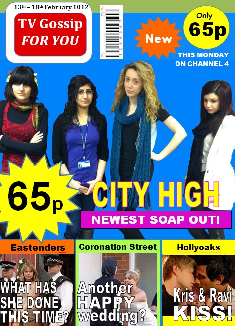
- Tanny with a funky hairstyle and fashion sense to display a crazy character.
- Amber with glasses and the only character wearing her ID badge, showing that she is the brainy one out of the four girls presented. Also, this presents to the audience that these four girls are students; showing that the soap is based on teenagers.
- Louise with the hand-on-hip pose to display her character as a confident, popular teenager.
- Diane, the most important character in the trailer, looking down rather than into the camera, and also standing away from Tanny, Amber and Louise.
The purpose of this was to leave the audience questioning the storylines behind our soap as the mysteriousness of Diane’s character shows that there is some sort of secret and leads back to the name of the soap “The Secrets Within”.
For the title, I decided to have the font enlarging for each of the three words to show the build up of tension in the soap; however, the colours used are almost playful with the title as the title seems sinister whereas the colours used are common casual colours used in TV listing magazines. I decided to use the colours pink and yellow for the title as together they look very feminine, clearly showing the audience that the soap is based on four teenaged female characters. This is effective in attracting our target audience as we intend to focus primarily on the female market, particularly teenagers and those who will relate well to the storylines of our soap.
For the background, I decided to use the colour bright blue as this allowed pictured to stand out more effectively and be attractive to the eyes of the audience. I then added the logo of the magazine using the colours red and white as these colours contrast well with the background, making it stand out more and look more vibrant.
I added the common things found in a TV listings magazine; such as the cost of the magazine, the bar code and the issue date. To reinforce the low price of the magazine to the reader, I decided to show the cost twice, with the use of a yellow star on the left of the magazine, and a yellow circle on the top right corner of the magazine. The colour yellow works well as it stands out in the magazine, contrasting well with the blue background and drawing the reader’s attention to the relatively low price of 65p. This is a decent price as our target audience are teenagers (some being students) who may not be able to afford high priced magazines.
I used the bottom quarter of the magazine cover to display the storylines of other soaps; such as Eastenders, Coronation Street and Hollyoaks, using different coloured boxes to present each one in, making a differentiation between the soaps. I advertised these three soaps on the cover of my magazine as they are well-viewed and successful. Therefore I promoted them on my magazine cover to encourage readers to purchase the magazine.